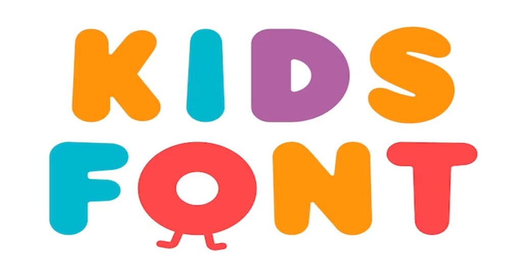
In the ever-evolving landscape of design and aesthetics, choosing the right font plays a pivotal role in conveying a message effectively. When it comes to creating content that resonates with a younger audience, such as children, the choice of fonts becomes even more critical. Children are naturally drawn to visually appealing and engaging designs and the fonts you choose can significantly impact their understanding and engagement with the content. In this article, we will delve into the realm of kids’ friendly fonts, discussing the top five fonts that are perfect for captivating and educating young minds.
1. Comic Sans MS: The Playful Classic
Comic Sans MS has long been a staple in educational materials and children’s literature. Its whimsical and playful appearance makes it an instant favorite among young readers. The rounded edges and slightly irregular letterforms resemble hand-drawn characters, creating an approachable and friendly vibe. This font is particularly well-suited for storybooks, worksheets, and materials aimed at early readers. However, its overuse in the past has sparked some controversy, so it’s essential to balance its application with the context and target audience.
2. Dyslexie: Enhancing Readability
Designed with dyslexic readers in mind, Dyslexie font is a revolutionary typeface that prioritizes readability for individuals with dyslexia. However, its benefits extend beyond just that. The unique letter shapes and spacing also make it an excellent choice for young learners. The distinctiveness of each letter minimizes confusion, aiding children in differentiating between characters effortlessly. Whether in print or digital media, Dyslexie font ensures that children can focus on the content rather than struggling with deciphering the letters.
3. Schoolbell: Nostalgic Charm
Embracing a touch of nostalgia, Schoolbell font effortlessly transports us back to the blackboard and chalk era. With its handwritten appearance and irregular line thickness, this font exudes an informal and friendly vibe that resonates with children. It’s an excellent choice for educational posters, worksheets, and craft projects. The simplicity of Schoolbell font captures the essence of a classroom, making learning feel more approachable and enjoyable.
4. Fredoka One: Quirky and Captivating
For a more contemporary and playful feel, Fredoka One font steps into the limelight. Its bold and rounded letterforms give off a sense of whimsy and adventure. This font is perfect for titles, headings, and design elements that need to grab a child’s attention instantly. Whether it’s a book cover or a game interface, Fredoka One font adds an element of quirkiness and excitement that resonates with young audiences.
- The Playful Appeal
Fredoka One’s distinctive appearance immediately catches the eye. Its bold and rounded letters give off an air of playfulness that resonates with both children and the young at heart. The font’s unique design evokes a sense of adventure and curiosity, making it an excellent choice for projects aimed at engaging and captivating audiences, especially children.
-
Versatility in Design
One of the remarkable features of Fredoka One is its versatility. It seamlessly adapts to a wide range of design projects, making it suitable for various contexts. Whether you’re working on a book cover, a website interface, a game app, or even a poster for a school event, Fredoka One’s quirky charm can instantly elevate the visual appeal of your content.
- Pairing Possibilities
While Fredoka One is a standout font on its own, its quirky charm also makes it a fantastic candidate for font pairing. Combining Fredoka One with complementary typefaces can create a visually appealing contrast that enhances the overall aesthetic of your design. Whether paired with a clean sans-serif font for balance or more elaborate script font for added flair, Fredoka One’s versatility shines through.
- Adding Personality to Branding
For businesses and brands looking to infuse their identity with a dash of personality, Fredoka One offers an excellent solution. By incorporating this font into your branding materials, you can convey a sense of playfulness and creativity that resonates with your target audience. From logos to promotional materials, Fredoka One helps you create a brand image that stands out in the minds of consumers.
5. KG Fonts: Versatile Delight
The KG Fonts family offers a diverse range of options that cater to different themes and moods. From KG Miss Kindergarten’s cheerful and casual style to KG Red Hands’ bold and eye-catching appearance, these fonts provide versatility for various content types. Whether it’s a learning app, coloring book, or educational website, KG Fonts have you covered with their engaging and kid-friendly designs?
In conclusion, the world of typography offers a plethora of options when it comes to kids’ friendly fonts. Choosing the right font can significantly impact a child’s engagement and understanding of content. From the classic playfulness of Comic Sans MS to the contemporary charm of Fredoka One, each font brings its unique appeal to the table. Remember to consider the context, readability, and overall aesthetic when selecting a font for children. By incorporating these top five kids’ fonts into your design arsenal, you can create captivating and educational content that resonates with young minds.
